Design
Our visual identity is made using a unique design system where various components put together create our very distinctive visual profile. It is important to follow the guidelines in order to achieve a uniform expression in harmony with our identity and to ensure a strong recognition.
As of June 2023 we have stopped using the graphical elements like the pattern or image overlays. There is a new typography, and words and sentences should not be set all in caps.
Logo
The KONGSBERG wordmark is one of our brands main identifiers. It has been specially designed to achieve individuality, harmony and balance.
There are certain rules to follow when using the KONGSBERG logo, which are outlined below.
Note! Do not use the logo in variations other than how it is described here.
The logo consist of two parts: symbol + logotype. The proportions between the logotype and the symbol are different in the different versions. The symbol being the cornerstone, dictates the size of the logo.
Please read all the guidelines about the logo before using it.
Logo variants
Centered version
The centered version of the logo is the main logo. This version requires a lot of room around it for the logotype to be legible.

Horizontal version
The horizontal version of the logo should be used where the main logo is not well suited or where the logotype will not be legible. Also, this version allows for more focus and space for heading and other copy.

Vertical version
The vertical version of the logo is made for narrow, tall or long formats, where the logotype would be too small with the main version. Examples would be vertical banners etc.

Please respect the minimum protective area (described below), and do NOT scale the elements seperately. The logo, in all versions, should be treated as one unit.
Colour versions
All variations of the logo are available in different colour versions; Full colour (positive and negative) and monochrome (black and white).
The color version of the logo should be used in most cases. A black and white logo can be used if only one color is possible, either in print or digitally. The logo can be used tone on tone as a more discreet version on, for example, clothing. If there are no restrictions on the use of colours, then the color logo should always be used.

Protective area
Every logo has a set minimum protective area that's proportional to the symbol, as shown in the illustration below. This is to provide sufficient visibility for the logo and to avoid a crowded impression. Do not allow text, graphics or other elements inside this area.
Social media
In social media the profile image should be the logo symbol. For better brand recognition it is advisable to expand the red box of the logo symbol to make it cover the entire profile image, while the yellow K keeps the same distance from the edge on top and bottom.


Examples of use
As a general rule, you should use the main centered version of the logo. If the format makes it hard to see or read the name in the main centered version, consider the vertical or horizontal version.


DO NOT
The logo versions should NOT be altered in any way, and should only be used as they are in the original files in the download section. Don't change the colour or position of the logotype, and don't scale the elements individually or separate them. Please respect the minimum protective area that is set up around the logo and don't add other / new elements or text in that area.

Colours
The use of space between elements is vital to create a modern and clean expression.

Logo colours
Kongsberg red - Red three
Hex #D71D15 | RGB 215/29/21 | CMYK 0/100/75/10 | PMS 200
Kongsberg yellow - Yellow four
Hex #FFF572 | RGB 255/245/114 | CMYK 0/0/68/0 | PMS 101
Kongsberg blue - Blue one
Hex #001639 | RGB 0/22/57 | CMYK 85/50/0/85 | PMS 296
Brand colours
There are 40 colours in the Kongsberg identity, and they should be used to show the vitality of the Kongsberg brand. No Business Unit has its own seperate colour, and it's adviced not to use too many colours together.

Red one
Hex #470B16 | RGB 71/11/22 | CMYK 40/100/65/70 | NCS 8010-R10B |
RAL 4007
Red two
Hex #870C21 | RGB 135/12/33 | CMYK 0/100/100/45 | NCS 5040-R |
RAL 3004
Red three
Hex #D71D15 | RGB 215/29/21 | CMYK 0/100/75/10 | NCS 1580-Y90R |
RAL 2002
Red four
Hex #EF91A1 | RGB 239/145/161 | CMYK 0/55/15/0 | NCS 1020-R10B |
RAL 3015
Red five
Hex #FAE6E9 | RGB 250/230/233 | CMYK 0/10/2/0 | NCS 0603-R20B |
RAL 9001

Yellow one
Hex #E77601 | RGB 231/118/1 | CMYK 0/70/100/0 | NCS 1080-Y50R |
RAL 2000
Yellow two
Hex #FABB3E | RGB 250/187/62 | CMYK 0/25/100/0 | NCS 1060-Y20R |
RAL 1017
Yellow three
Hex #F9DD4A | RGB 249/221/74 | CMYK 0/10/85/0 | NCS 0560-Y |
RAL 9001
Yellow four
Hex #FFF572 | RGB 255/245/114 | CMYK 0/0/68/0 | NCS 0603-R20B |
RAL 1015
Yellow five
Hex #FFFFDF | RGB 255/255/223 | CMYK 0/0/20/0 | NCS 0507-G80Y |
RAL 9001

Forest one
Hex #374E2D | RGB 55/78/45 | CMYK 73/46/87/45 | NCS 7020-G10Y |
RAL 6002
Forest two
Hex #5B834D | RGB 91/131/77 | CMYK 70/40/85/0 | NCS 5040-G20Y |
RAL 6011
Forest three
Hex #6EA25D | RGB 110/162/93 | CMYK 62/18/81/2 | NCS 4040-G20Y |
RAL 6021
Forest four
Hex #ADD8A0 | RGB 176/216/160 | CMYK 34/0/48/0 | NCS 2020-G20Y |
RAL 6019
Forest five
Hex #D8FACF | RGB 216/250/207 | CMYK 10/0/20/5 | NCS 0515-G20Y |
RAL 9002

Green one
Hex #223F2E | RGB 34/63/46 | CMYK 100/0/100/70 | NCS 8010-B90G |
RAL 6036
Green two
Hex #0A9754 | RGB 10/151/84 | CMYK 90/15/100/0 | NCS 4550-G |
RAL 6037
Green three
Hex #15C370 | RGB 21/195/112 | CMYK 75/0/80/0 | NCS 2565-G |
RAL 6038
Green four
Hex #49E092 | RGB 73/224/146 | CMYK 60/0/65/0 | NCS 2050-B90G |
RAL 5024
Green five
Hex #CBFAD5 | RGB 203/250/213 | CMYK 19/0/22/0 | NCS 1010-G10Y |
RAL 9002

Teal one
Hex #014A42 | RGB 1/74/66 | CMYK 91/47/68/44 | NCS 8010-B70G |
RAL 6026
Teal two
Hex #08A698 | RGB 8/166/152 | CMYK 90/0/45/0 | NCS 4055-B40G |
RAL 5018
Teal three
Hex #09BCAD | RGB 9/188/173 | CMYK 70/0/30/0 | NCS 3060-B70G |
RAL 5012
Teal four
Hex #5DE1D9 | RGB 93/225/217 | CMYK 50/0/20/0 | NCS 2050-B50G |
RAL 6027
Teal five
Hex #BCFFF3 | RGB 188/255/243 | CMYK 22/0/10/0 | NCS 0520-B60G |

Blue one
Hex #001639 | RGB 0/22/57 | CMYK 85/50/0/85 | NCS 8505-R80B |
RAL 5010
Blue two
Hex #174283 | RGB 23/66/131 | CMYK 100/90/0/0 | NCS 4550-R80B |
RAL 5019
Blue three
Hex #2463C2 | RGB 36/99/194 | CMYK 85/64/0/0 | NCS 3060-R90B |
RAL 5015
Blue four
Hex #629EF9 | RGB 98/158/249 | CMYK 60/30/0/0 | NCS 0540-R90B |
RAL 5012
Blue five
Hex #DAF2FF | RGB 218/242/255 | CMYK 20/0/0/0 | NCS 0510-B10G |
RAL 9003

Sand one
Hex #5A3D18 | RGB 90/61/24 | CMYK 45/64/95/60 | NCS 7020-Y80R |
RAL 8007
Sand two
Hex #84643C | RGB 132/100/60 | CMYK 40/54/82/24 | NCS 5040-Y30R |
RAL 1011
Sand three
Hex #AA906E | RGB 170/144/110 | CMYK 30/40/60/0 | NCS 4020-Y20R |
RAL 1019
Sand four
Hex #DACAB4 | RGB 218/202/180 | CMYK 14/18/29/0 | NCS 2010-Y20R |
RAL 7044
Sand five
Hex #F8F2EB | RGB 248/242/235 | CMYK 0/0/10/5 | NCS 0603-Y60R |
RAL 9001

Grey one
Hex #393B3F | RGB 57/59/63 | CMYK 80/70/70/30 | NCS 7500-N |
RAL 6012
Grey two
Hex #64686D | RGB 100/104/109 | CMYK 70/60/55/0 | NCS 6005-B20G |
RAL 7005
Grey three
Hex #868C93 | RGB 134/140/147 | CMYK 55/45/35/0 | NCS 4500-N |
RAL 7046
Grey four
Hex #B3B7BC | RGB 179/183/188 | CMYK 0/0/0/33 | NCS 3005-B20G |
RAL 7038
Grey five
Hex #EBEBEB | RGB 235/235/235 | CMYK 7/5/5/0 | NCS 1002-G |
RAL 9003
Colour contrasts
Good contrast in colours are important for legibility, usability and is actually required by law in Norway. For graphical elements and large text, the contrast should be higher than 3:1.

For those who use the Adobe Creative Suit: there are two swatch colour librabries available in CMYK and RGB. (.ase files) These can be uploaded in Illustrator and InDesign in the colour swatch window.

Typography
Typography is the main tool in KONGSBERGs visual identity, and contribute to good recognizability and is an identity marker. The typography of the KONGSBERGs brand is Söhne. The functional typeface radiates a solid, bold, friendly and clear appearance. Söhne is a sans serif typography designed by Klim Type Foundry, released in 2019. The typeface is inspired by Unimark’s legendary wayfinding system for the NYC Subway.
The typeface consists of eight fonts ranging from Extraleicht to Extrafett. KONGSBERG recommends the use of mainly Halbfett and Buch, but more can be used if further contrast is needed.
This typface should be used on all communication and marketing materiall.
Main typography
Söhne Halbfett headline
ABCDEFGHIJKLMNOPQRSTUVWXYZÆØÅ
abcdefghijklmnopqrstuvwxyzæøå
1234567890!?#()”%&
Söhne Buch lead paragraph and copy
ABCDEFGHIJKLMNOPQRSTUVWXYZÆØÅ
abcdefghijklmnopqrstuvwxyzæøå
1234567890!?#()”%&
For use internally in KONGSBERG, an internal license can be acuired by contacting the Communication department.
For users outside of KONGSBERG, the font can be purchased from the Klim Type Foundry.
Microsoft Office typography
In Office templates, such as Powerpoint and Word, we use the system font Arial as a replacement for Söhne. Arial is available in Regular and Bold weights with corresponding italic versions. Bold is used for headings and for highlighting in body text. Regular is used for body text.
Arial Bold
Arial Regular
Line height
Screen sizes, amount of text and layout all play a key role in setting a good line hight. As a rule of thumb you can use these sizes to make the text easy to read.
Headings: Size of text x 1,1
Copy: Size of text x 1,4
(A heading in size 50 will get a line height of 55, and copy with size 10 will get a line height of 14).

Photo
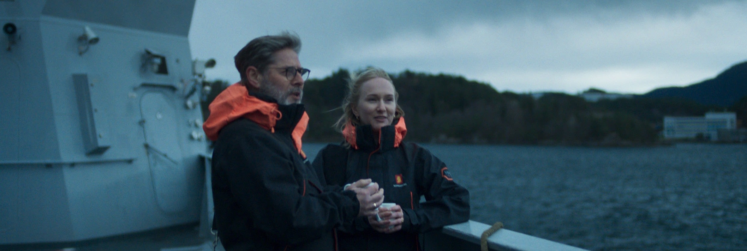
Our images should reflect our brand pillars: creative joy, safety, technology and sustainability. We should strive for authentic images using real employees in real scenarios.
To talk about sustainability we place our products, solutions and people in a natural setting. Whether it's fragile landscapes or rough and powerful nature, it's all about the environments we want to protect.
Images of people should convey the joy of creating, showing people in natural environments working, or looking straight into the camera, being proud of working for KONGSBERG.
Brand Images


Icons
The icons are a continuation of KONGSBERG's design expression, with similar solid, bold, friendly and distinct appearance as the brand typography. The icons visualise business areas, services and functionality, and are used both as illustrative elements and for navigation. The distinct style also makes it easy to develop new icons when needed.
The icons are made in two sizes for optimal display: 120x120 px when used as illustrations, and 24x24 px when used as navigation. The larger icons allows more details compared to the smaller ones.
Examples of large icons 120x120 px, 4px line thickness. And shown small in 24x24 with 1 px line thinkness.
Icons grid
The icons are designed in a simple, modern and geometric way. Draw the icons on a square grid. Also remember to draw the icons in two sizes for optimal display.
On large icons, a grid of 120x120 px is used, and line thickness should be 4 px.
On small icons, a grid of 24x24 px is used, with a line thickness of 1 px.
Make sure the line endings have sharp corners and caps.

Co-branding
Partner co-branding for the KONGSBERG brand
KONGSBERG is a monolithic brand, which means that one logo and brand expression covers all subsidaries and divisions. There are no sub-brand logos.
The logo consist of two parts: symbol & logotype. The proportions between the logotype and the symbol are different in the different versions. The symbol being the cornerstone, dictates the size of the logo.
There are certain rules to follow when using the KONGSBERG logo and these are outlined below.
Note! Don't use the logo in variants other that how it is described here.
Logo
Logo
01. The centered version of the logo is the main logo and should be used in most cases. This version requires a relatively large space in order for the logotype to be legible.
02. The horizontal version of the logo should be used in wider formats where the main version is not well suited and the logotype won't be legible, for example wide banners, both digital and printed.
03. The vertical version is made to fit narrow, tall and long formats, where the logotype of the centered version would be too small. Examples would be vertical banners, the sleeve of a jacket etc.
04. All of the logo versions have a mono (black) and a negative (white) version.
Logo alternatives
Logo alternatives
The centered version of the logo is the main logo and should be used in most cases.
01. In cases where two different logo alternatives would fit, always choose the main centered verson of the logo.
02. In formats that are extremely narrow or wide, the main logo will have legibility issues, i.e. the wordmark will become too small and difficult to read or see. For example in banners, narrow flags and advertisements etc. use the version that creates the best visibility as illustrated.
Logo placement
Examples of logo placement
In cases where the KONGSBERG logo is placed together with many other logos or other elements, make sure there is enough space around. Use the protective area as a minimum buffer around the logo.
01. Correct use of protective area
02. Incorrect use of protective area
Logo – Do not
Logo – Do not
The logo versions should NOT be altered in any way, and should only be used as they appear in the original files.
– Do not change the colour, placement or proportions of the logotype.
– Do not add a secondary text within the protective area of the logo.
– Do not scale the elements individually or separate them.
Please respect the mininimum protective area that is set up around the logo, and do not add other or new elements or text within that area.
When enlarging or reducing the size of the logo, always do so proportionally. Do not stretch it in just one direction.
Logo placement
Examples of logo placement
1. The logo can ble placed in any corner of a format, but preferrably in the top half.
02. Always respect the minimum protective area of the logo. Do not place other elements within this area, and do not hang the logo at the very edge of the format.
Logo and subsidiaries
Logo and Subsidiaries
KONGSBERG is a monolithic brand. This means that one logo and brand expression covers all subsidiaries and divisions. There are no sub brand logos.
If or when the subsidiaries needs to be separated or made a clear difference between them, do not alter the logo.
Use text, like a headline to communicate the name of the subsidiary.
01. Example from a website where the logo has been altered. Do not do this.
02. Use the main logo with enough space around. Use at least enough space to honour the minimum protective area, preferrably more. Then use text, like a headline to describe the different subsidiary names.
Levels of co-branding
Levels of co-branding
There can be three levels of co-branding for channel partners:
01. KONGSBERG is lead. This means that our visual identity is used, and partner logos are given less space compared to the KONGSBERG logo.
02. Equal partnership. All partners have equal ownership to the product, and none of the brands visual identity should be used. In these cases use a neutral identity without brand elements from any of the brands.
03. Partner is lead. The partner's visual identity is used with a smaller version of the KONGSBERG logo. Please see instructions about the protective area of the logo and rules of placement. Place the KONGSBERG logo in a corner, and provide enough space around the logo to comply with the minimum protective area.

Contact information for KONGSBERG Brand
For all inquireries contact us: